If I Made A Case Study About Making A Case Study, What Would Be The Useful : Pointless Ratio?
I was warned that I’d need to learn to make a case study using this project. It seemed daunting to show the full process, but I come from a proud line of borderline hoarders and cautious savers, so I’d been documenting my work.
A case study is a presentation showing where your project started, where it ended, and how it got there, and each part of the presentation builds on the last. If you’re an animator, it’s similar to a show bible. The hardest thing for me was knowing exactly what to leave out. For instance, while but I’m happy to show them here, I didn’t end up needing to show both of the below mood boards in the study. Similarly, I have several iterations on my style sheet that would only clog space in a presentation.
The mood board on the left started out as the one on the right. At the time, I thought the old version was Clean. Simple. Elegant. Now I look at it and wonder why I was feeling so lethargic that week.
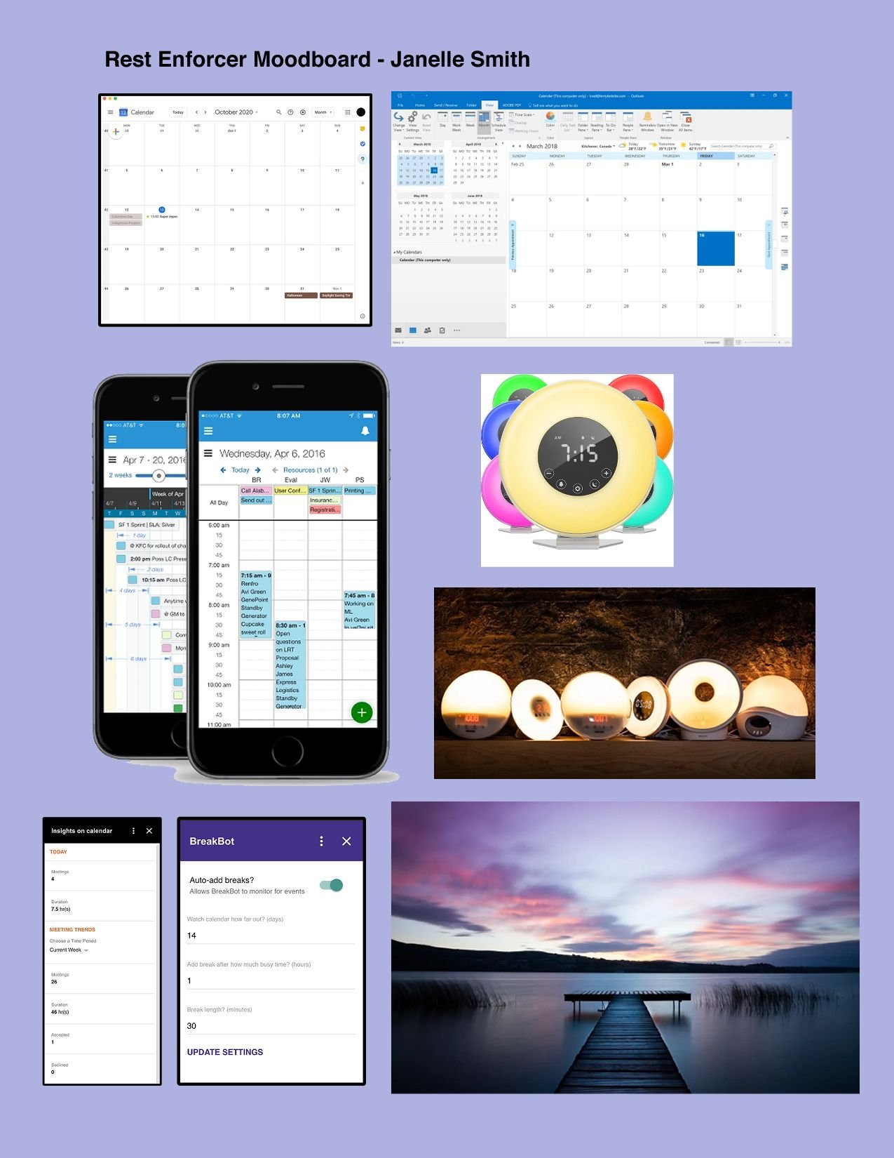

I was looking for a mood of naptime, softness at the end of day, a warm glow, and dusk. “Rest Enforcer” sounds like a jackbooted soldier will break down your door and chloroform you to sleep. That might be necessary in some cases, but it wasn’t the mental image I wanted to project, so after this point, the name changed to Down Time. That’s something to note in a study, too: if your project name changed, mention why.
It would be important to show what worked, what didn’t, and any research behind your choices. In my case (mild pun intended), I thought I was working on a visually accessible application, and quickly learned that I was not.


The early sketch for the Down Time splash page might take heavy cues from the mood board, but it simply did not work for its intended use. Yes, there are cute fireflies that I imagined would light up after the stars and moon appeared. I couldn’t pass up a chance to animate. But no one was going to see those stars, or those hills, against that sky and water. Most importantly, no one was going to see that title against that background with those low contrast levels. The color scheme shifted from sweet lavender to soothing violet to allow for more potential users, and in the case study, I explained why I changed this for the better. The stars are still faint, but it’s OK - they’re far less important than the title, and can be adjusted for future iterations. A case study really comes down to one question: What does the research suggest? My research said the color scheme needed more contrast.
Also note that I got much better at designing in Figma in the short time between creating those images. I’m proud of that.

At some point, I had a grandiose idea of creating multiple design options for the user. They could use a night option for a more restful feel, or a daytime design to get them in the mood for their hobbies during break times. I eventually left the daytime designs out of the case study, because not only did they not fit the narrative, but they had nothing to do with the research. I tested the daytime designs in a prototype, and they did not go over well with the majority of potential users. “I thought it would be cool” doesn’t make sense when no one wants it, so the bright designs got scrapped, I moved on, and my case study gained a more focused point of view.
My eventual study was 18 slides long. As always, I not only showed it to my mentor during updates, but sent it to some UX colleagues and presented it at a design critique for feedback. For my first go at this, I feel like I did an alright job. I’m looking forward to the point where I feel more comfortable going about this entire process. Right now, I’m in the “excited to not know so many things, comma, want to know more” phase. I kind of hope that never fully goes away.